WordPress doesn’t have any built-in features to accommodate modern retina displays in mobile devices. So if you want to serve up different images based on the visitor’s display capabilities, you’ll need some help from a plugin.
Today, I’m going to introduce you to the WP Retina 2x plugin, which does the job of both generating Retina-sized images and also detecting the best images to serve to which visitors.
What is a Retina Display?
In simple terms, a Retina screen displays more pixels in the same space as a standard display. It has an increased pixel density. This has the effect of increasing the perceived quality of graphics and images. For instance, the edges of icons and fonts appear less “jagged.”
The term “Retina” is referred to as a marketing template and not a technical specification. Apple classifies displays with widely varying resolutions as Retina. Also, every other mobile device manufacturer now makes screens with Retina display resolutions, which is to say, similar pixel densities.
So for all intents and purposes, when we talk about “Retina” mobile displays, we’re talking about all mobile devices and not just iPhones.
The reason we should pay attention to a Retina display in WordPress is the increased resolution of the displays on mobile devices makes images (and icons) appear half the size they do on a standard resolution screen. So for our WordPress site to provide images that appear “full size” on a Retina-type display, we have to provide images twice as large as we normally would.
I’m going to talk about pixel sizes here – dimensions, not image resolutions. Things become more complicated when you get into the use of higher resolution images, and that kind of discussion is beyond the scope or purpose of this tutorial.
How WordPress Processes the Images We Upload
When you upload an image to the WordPress Media Library, up to five smaller copies of the image are generated. How many smaller images are generated depends on the size of the original. The larger the original image, the more smaller versions are generated.
For example, an original image that is 3200 x 1800 pixels in size will generate the smaller sizes: 1568 x 882, 1024 x 576, 768 x 432, 300 x 169, and 150 x 150. While an original that is 628 x 628 pixels generates only two smaller images: 300 x 300, and 150 x 150.
The WP Retina 2x plugin allows you to automatically create double-sized images from the Media Library in WordPress to optimize images for mobile, or Retina, displays. Let’s take a look at how it works.
Installing the WP Retina 2x Plugin
Log in to your WordPress admin panel.
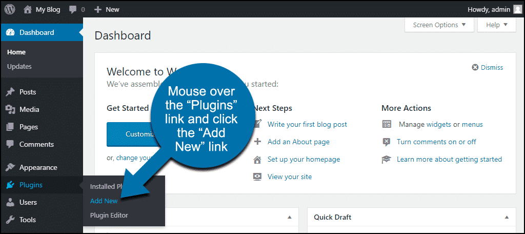
In the left column navigation, mouse over the “Plugins” link and click the “Add New” link.
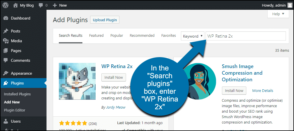
In the “Search plugins…” box, enter “WP Retina 2x.”
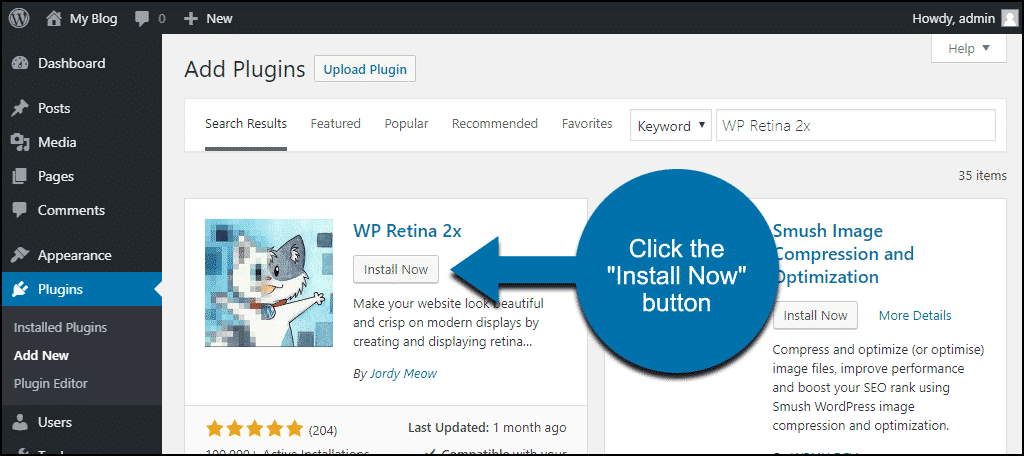
Once you have located the plugin, click the “Install Now” button.
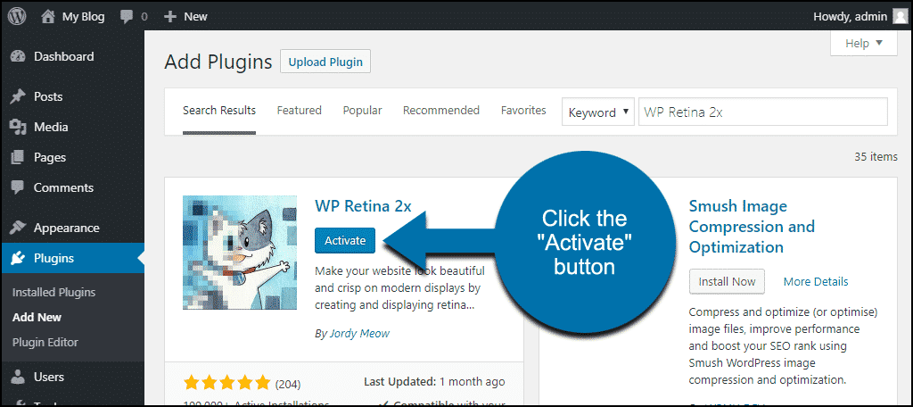
When the plugin has been installed, click the “Activate” button.
Using the WP Retina 2x Plugin
The paid version of WP Retina 2x will automatically perform re-sizing on images uploaded to the Media Library. We’re working with the free version here, so we’ll have to do things manually. (Smaller Retina thumbnails can be generated automatically, I’ll talk about that later.)
It’s still an easy process, and you can process images in bulk.
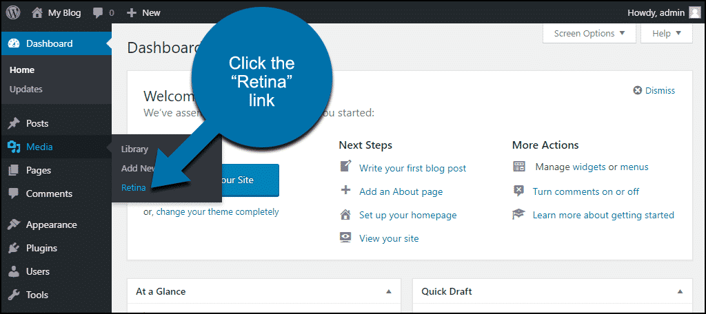
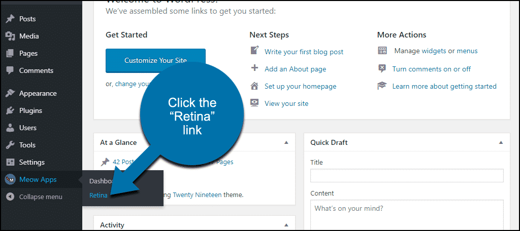
In the left column navigation, mouse over the “Media” link and click the “Retina” link.
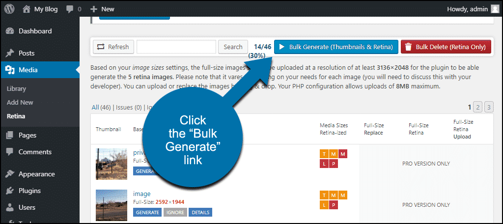
You can click the blue “Bulk Generate (Thumbnails & Retina)” button and be finished. Everything else works without any configuration. You’ll have Retina versions of all of your images, and the plugin will detect Retina-type displays, so it knows which versions of the images to serve to each visitor.
But Where’s the Fun in a One-Click Process?
Even if you use the bulk generator, you’ll have to come back and process images individually whenever you upload a new one. So let’s process some images individually and look at what happens when we do.
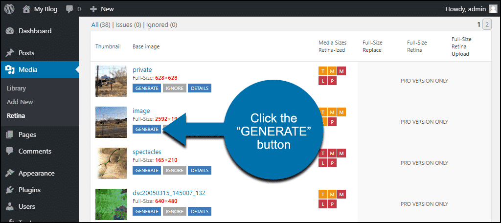
Mouse over the “Media” link and click the “Retina” link. You’ll see a display of the images in your Media Library. If we look at the image imaginatively titled “image,” you can see the dimensions of the original file (2592×1944).
The only button available to us in the free version of the plugin is “GENERATE,” so let’s click it.
You’ll see that some of the “Media Sizes Retina-ized” icons have changed color.
But other than that, there’s no indication of what the plugin did. So let’s look at the files on the server.
Before we ran WP Retina 2x, we had the image sizes that WordPress generated when the image was uploaded.
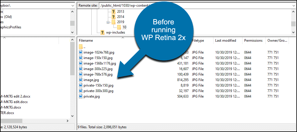
After running the plugin, you can see that new images have been generated, and an “@2x” suffix has been added to the file name.
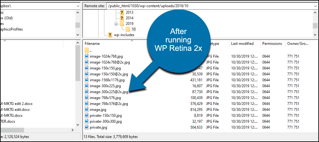
The “@2x” suffix is used by the plugin to know which version of the image to serve to Retina-type displays. That’s important because as you can see, the newly generated images are 5 to 5.5 times larger than the originals, so the download time is going to be significantly longer.
Wait, the Images Are How Much Larger?
The dimensions of the image are doubled, and the file size is five to five-and-a-half times larger than the original.
I know. That’s a significantly larger file.
You’d think that you’d want to serve a smaller file size over a mobile network. That’s the logical approach. But there’s no “Retina” without larger files, so logic seems to have been quietly set aside and ignored in this case.
With mobile networks continually gaining speed, and providers moving toward unlimited bandwidth plans, I suppose saving bits (or megabytes, in this case) becomes less important every day.
Page loading speed is still important to Google however, so you have to decide what the priorities are for your particular website.
Configuring the Retina Display Plugin Settings
In the left column navigation, mouse over the “Meow Apps” link and click the “Retina” link.
It isn’t necessary to make changes to most of the settings here, but there are a couple of notable exceptions.
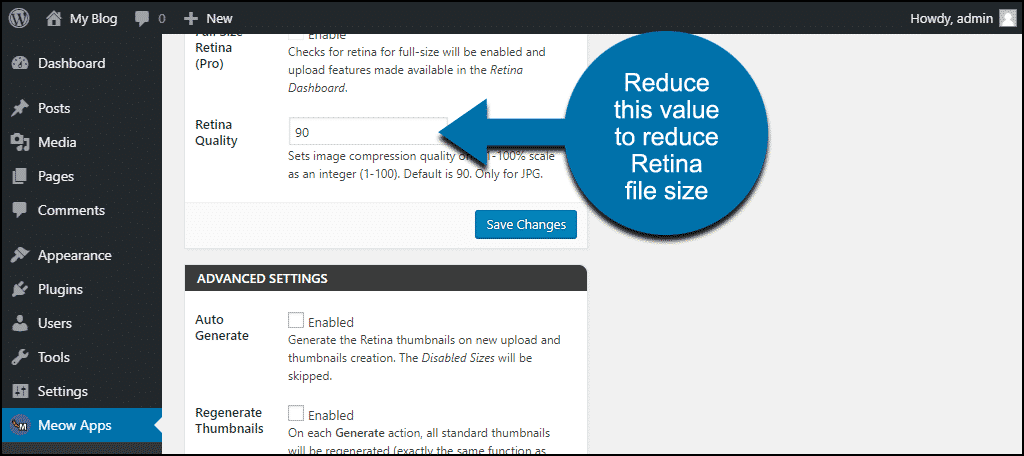
First is Retina Quality. The default level is 90, which is high. Remember those larger file sizes we talked about earlier? If most of your images are .jpgs, you can reduce the file sizes by reducing the “Retina Quality” value to 80 or even 70.
For what it’s worth, I don’t see any significant jpg degradation until I get below a quality setting of 70, so that’s the setting I use in all my jpg images for the web.
Next, enabling Auto Generate will make WP Retina 2x automatically generate Retina versions of the two smallest thumbnails any time you upload an image to the Media Library. This is especially handy if you only intend to use Retina-sized images for your thumbnails (where they may be of the most use).
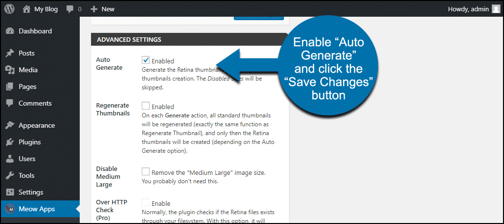
Click the “Save Changes” button to save your configuration.
For details on the other configuration settings, check out the WP Retina 2x documentation.
Why It’s Important to Optimize WordPress Images for Retina Displays
Remember, 40 to 50% of your website traffic—no matter what kind of site—is mobile traffic. Pretty much every new phone sold has a Retina-type display. If we ignore Retina, we are short-changing half of our visitors.
We’ve quickly gone from a landscape where serving larger images was optional to one where it is a necessity.
Again, that has to be balanced with page load speed. But if mobile users’ expectations have changed to demand larger images for their higher-resolution displays, you don’t want to be left behind by half of your potential audience.
Where do you land on the size vs. performance spectrum? Have you implemented Retina image sizing on your website(s)? Let me know in the comments. We love hearing from you.