Your call to action button is one of the most important elements of getting a visitor to engage (or buy!). But if your button is in a static position on a page, it can sometimes get pushed beneath “the fold.” A floating call to action button solves that problem.
The button can be placed in a prominent position and stay there as the page scrolls.
We’ll use the Buttonizer plugin for our call to action (CTA) button. Buttonizer has a lot of built-in functions. So it’s easy to create buttons that take your visitor to a URL, initiate a chat, a phone call, an SMS message, post to social media, and more.
Today, we’ll walk through the creation of a CTA button that sends the visitor to another page on your site. Then, we’ll briefly touch on some of the other options available with Buttonizer.
Installing the Buttonizer Plugin
Log in to your WordPress admin panel.
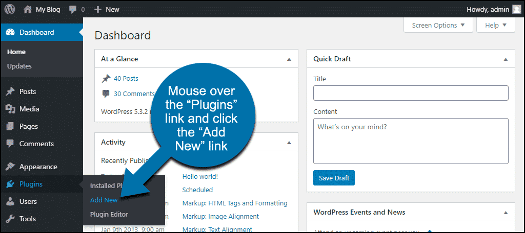
In the left column navigation, mouse over the “Plugins” link and click the “Add New” link.
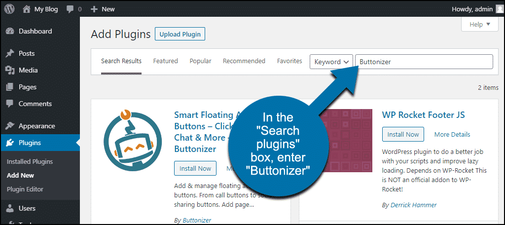
In the “Search plugins…” box, enter “Buttonizer.”
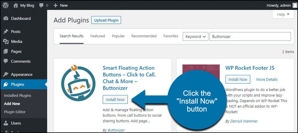
Once you have located the plugin, click the “Install Now” button.
Click the “Activate” button.

Using Buttonizer to Create WordPress Floating Button
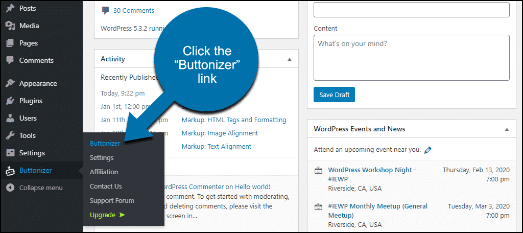
In the left column navigation, mouse over the “Buttonizer” link and click the “Buttonizer” link.
When Buttonizer opens, it also opens the home page of your site in a separate panel. That’s a preview so you can see what your floating call to action button will look like on the site.
By default, Buttonizer shows two buttons in a group. I’m going to delete one of them so we can focus on configuring a single button.
The first thing we’re going to do is click the wrench icon to access the basic button settings.
Here you set the button position, animation, style, action, and whether the button shows up on a desktop display, mobile, or both. Let’s go through each of the options.
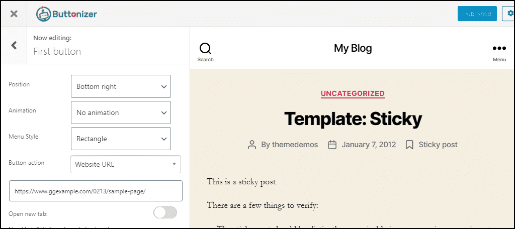
Position
This places the button in one of the corners of the site or a custom location. When you change the position in the drop-down, you can see the button move in the preview pane.
The custom location is useful if you want to set a button, say, in the middle of the side of the page. To do that, select “Custom” from the “Position” drop-down. Then set the “Y (%)” value to 50.
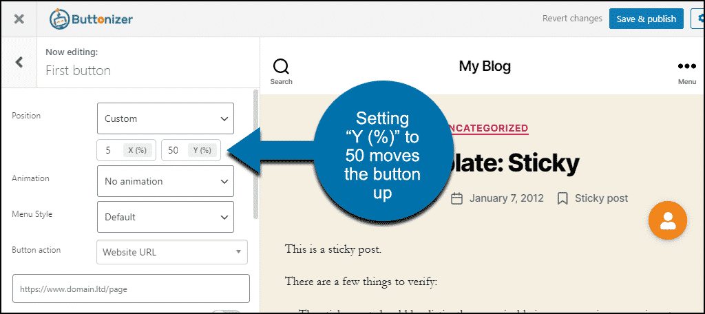
You can see that the button moves to the middle of the right side of the page. By playing with those X and Y axis values, you can place the button wherever you’d like on the page.
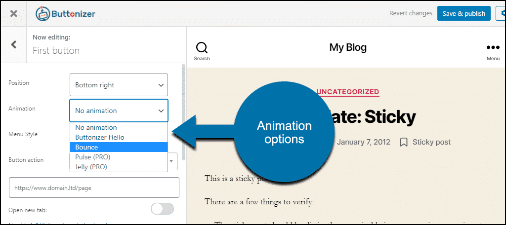
Animation
There are two animation choices in the free version of the plugin. They both run every 8 or 10 seconds to draw attention to the button.
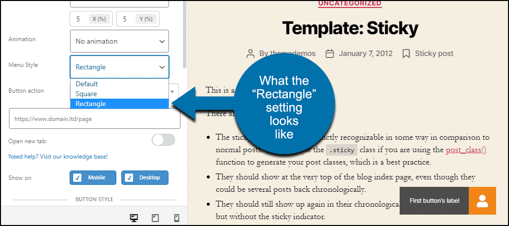
Style
Style changes the button from round (or default) to square or rectangular. If you choose Rectangle, the button label (we’ll get to that shortly) appears next to the button.
Action
“Button action” is where you choose what the button does.
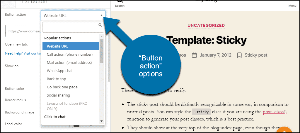
We’re configuring a button to go to a page on the site, but as you can see, there are many other options.
- Popular actions
- Website URL
- Call action (phone number)
- Mail action (email address)
- WhatsApp chat
- Back to top
- Go back one page
- Social sharing
- Click to chat
- SMS
- Facebook Messenger Chat Widget
- Facebook Messenger Link
- Twitter DM
- Skype
- LINE
- Telegram
- Viber
- Social Media
- Snapchat
- VKontakte
- Waze
- Popup
- Poptin
- Elementor Popup
- Popup Maker
- Popups – WordPress Popup
- Actions
- Copy URL to clipboard
- Print page
Creating a Link Button
Okay, now that we’ve gone over the basic settings, let’s create our button. Then we’ll take a look at some other things we can do with it.
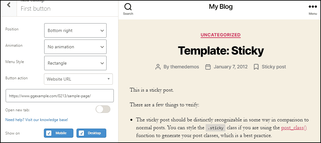
- I’m going to leave the “Position” set to the default lower right.
- I’ll pass on “Animation,” so we’ll leave that set to “No animation.”
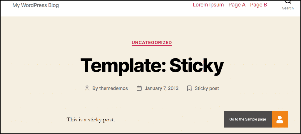
- For “Style,” I’ll choose “Rectangle.” That way, when I add label text to the button, it will be shown as a single rectangle. The label text will also show up in the “Default” style, but the text floats nearby in a separate container.
- The “Button action” is “Website URL.” I’ll enter the URL in the text field right below the “Button action” drop-down.
- I’ll leave the “Open new tab” setting in the default off position and leave the “Show on” “Mobile” and “Desktop” settings on.
This is what the configuration will look like when that’s all done:
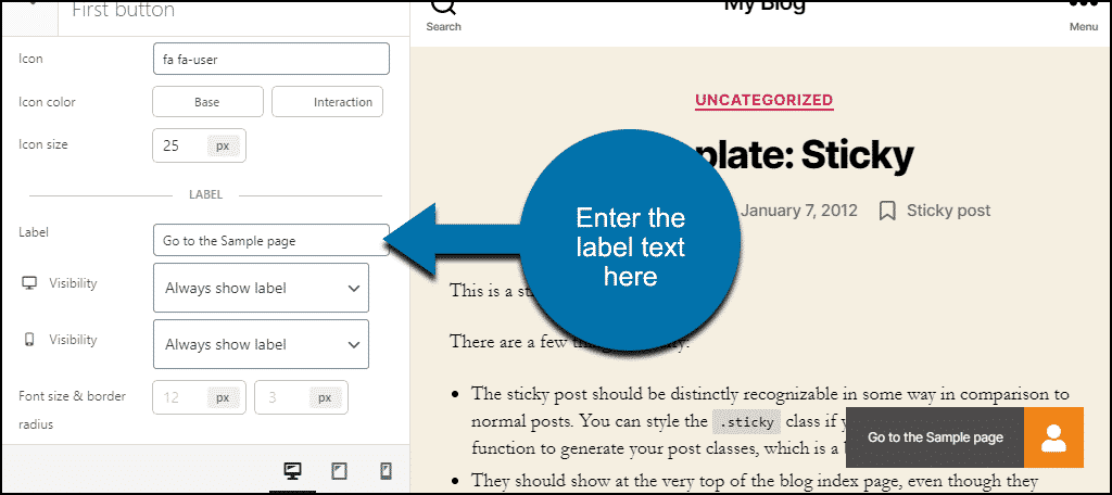
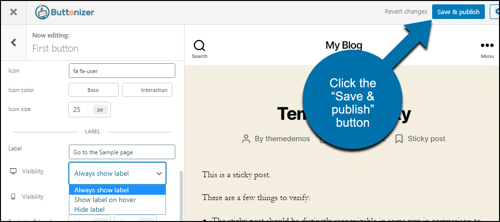
Before we save the button, we have to set the text that we want to show next to the button. So let’s scroll down to the label section.
In the “Label” field, we’ll enter the text. You can see how it looks in the preview. If you want a larger font size, you can set it as well.
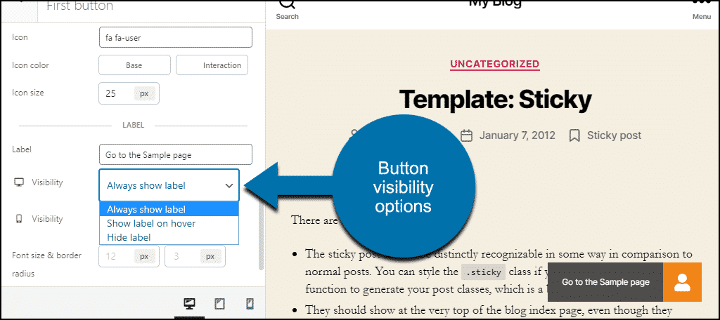
There are two “Visibility” settings, the first for desktop, the second for mobile. These settings allow you to hide the label on a desktop screen, or show it when a visitor hovers over. You can also hide the label entirely on mobile devices.
Since hiding the text of our button wouldn’t be a good idea (we don’t want to create a mystery button), we’ll leave these both set to “Always show label.”
Now I’ll click the “Save & publish” button, and the button will be visible on the website. When I scroll a page, the button stays in position. No matter where a visitor is on a given page, the button is always right there with them.
The Rest of the Button Configuration Options
We skipped over a couple of things, so let’s back up and check them out.
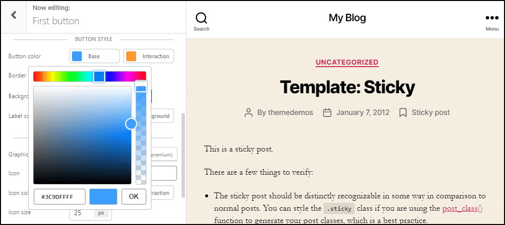
Button Color
Here’s where you can change the button color to fit into your website design. Choose “Base” or “Interaction” to open a color picker. “Base” is the normal color of the button. “Interaction” is the color the button will change to when a visitor hovers over it.
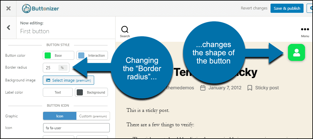
Border Radius
This controls the roundness of the button with a value between 1 and 50. Set to 50, the button is completely round. The lower the number, the more square the button becomes.
Here I changed the “Border radius” to 25, and you can see that the button becomes a square with rounded corners.
Label Color
The “Label Color” setting controls the background and text colors if you display the button label.
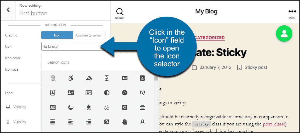
Button Icon
Finally, the “Button Icon” section is where you set the graphic element in the button. By default, the main button uses the Font Awesome “fa-user” icon. But you can select a different icon for your button.
Click in the “Icon” field to open the icon selector. You can scroll through the icons or search by keyword.
Click on an icon in the selector, and your button icon changes.
The “Icon color” section lets you choose different icon colors for “Base” and “Interaction.” By changing the colors here and in the “Button Color” section, you can create some interesting effects.
The “Icon size” setting controls, you guessed it, the size of the icon in the button.
Other Cool Buttonizer Features
The “Button action” setting is where Buttonizer shows off its potential.
Want to drop a WhatsApp floating button into your WordPress site? Choose “WhatsApp chat” in “Button action,” enter your WhatsApp number, and you’re done.
Choose “Social sharing” in “Button action,” and a large selection of social media sites are available. By adding buttons for each site you’d like visitors to share to, you can create your own floating social share panel.
There are a lot of options in Buttonizer, and many of them are available when using the free version of the plugin. My hat’s off to the developers for that. Many times, plugins with paid versions hide all of their cool features from free users. Buttonizer doesn’t do that.
Note About Google Analytics
There is an option in the Buttonizer settings to add your Google Analytics code to your buttons. Don’t add the Analytics code in Buttonizer if you are already using a Google Analytics plugin on your site.
If you add Analytics code to a button when the code is already present on a page, Google will think the target page was opened twice. That will cause your Analytics bounce rate on the target page to appear lower than it really is.
What Happens if You Uninstall the Plugin
If you uninstall the Buttonizer plugin, any buttons that you created will no longer be visible on the site.
The Benefits of a Floating Call to Action Button
The benefits of a call to action chat button or a “Click to Call” button are apparent. “Previous page” or “back to top” buttons are also calls to action, though not in a marketing sense. But they benefit your visitors in other ways.
Let’s face it though, a call to action is primarily there to benefit you, the site owner. It’s there to get visitors to buy your product or engage with you directly (so they will eventually buy your product).
If your call to action button or link is fixed at the bottom of a page of text, many of your visitors will never see it. So a floating or “stuck” CTA has the benefit of always being visible. A visitor can take action at any time.
Have you ever experimented with CTA placement to see what’s most effective for you? Does seeing the list of Buttonizer options give you any ideas for CTA that you may not have previously considered? Let me know in the comments!