
Does your WordPress website need access to a wide variety of charts and graphs? If so, the Visualizer: Table and Charts Manager for WordPress is the perfect plugin for the job.
The plugin provides over 15 different charts and graphs to the user (only 4 are free), it’s easy to use, and it even allows you to import data from Excel. Everything is handled directly in the Gutenberg editor, thus, everything is pretty simple.
Today, I will demonstrate how to use the Visualizer WordPress plugin to create charts and graphs.
This tutorial is for:
WordPress 5.9
Plugin: Visualizer: Table and Charts Manager for WordPress v3.7.4
Why Add Charts And Graphs in WordPress?
Charts, graphs and other visual content help improve the readability of content. They allow you to convert large data sets into easily digestible images that most visitors can read at a glance.
It’s also worth mentioning that when the average visitor sees a chart or graph, it gives off a more professional vibe. This can result in adding more credibility to your claims. Thus, making it even easier to prove a point.
Of course, these tools may not even be for your visitors.
While many website owners become familiar with Microsoft Excel or Google Sheets, you could also use these charts and graphs for your own website data, but I will advocate for using Excel, as it has far more power behind it.
In any event, let’s get into the tutorial.
How To Make A Chart In WordPress
Step 1: Install Visualizer: Tables and Charts Manager for WordPress
In summary, this plugin allows you to create a variety of charts in the Gutenberg editor. You can manually enter or import the data from another source like Excel. All you really need to do is install the plugin, create a chart, and add it to Gutenberg.
It’s really that simple.
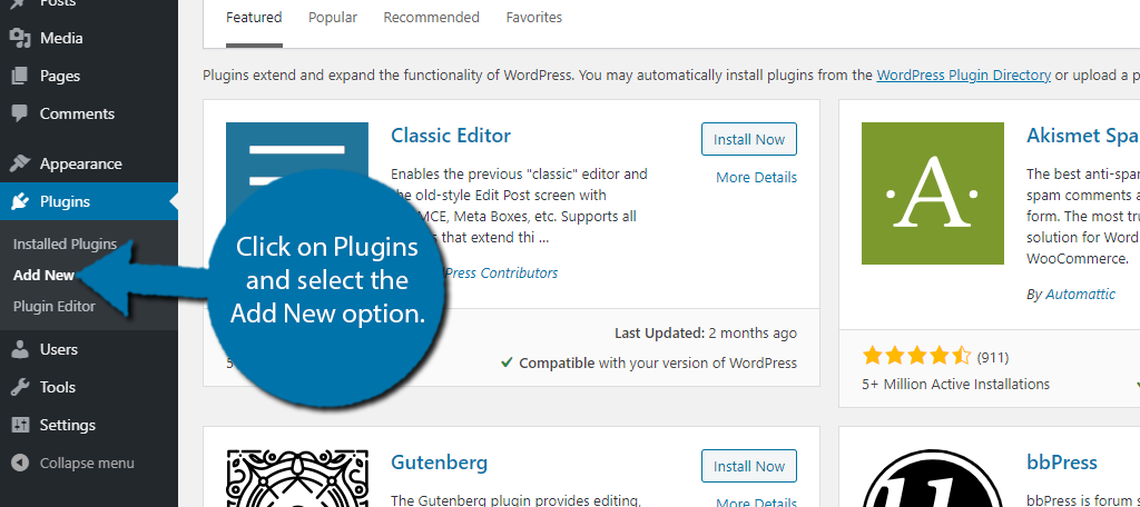
Let’s start by clicking on Plugins and selecting the Add New option on the left-hand admin panel.
Search for Visualizer: Tables and Charts Manager for WordPress in the available search box. This will pull up additional plugins that you may find helpful.
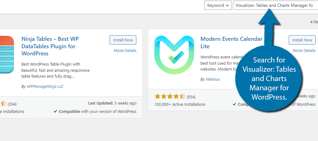
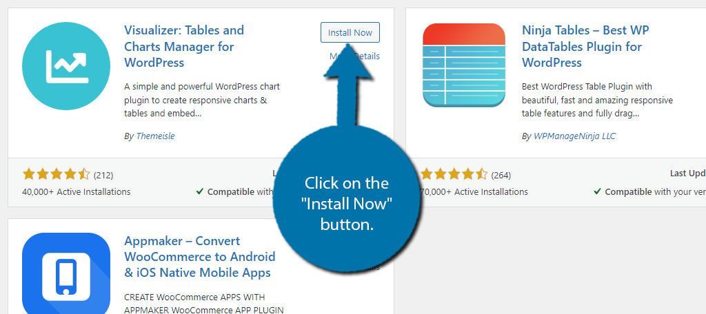
Scroll down until you find the Visualizer plugin and click on the “Install Now” button and activate the plugin for use.
Step 2: Create A Chart
With the plugin installed, you are now ready to start making charts in WordPress.
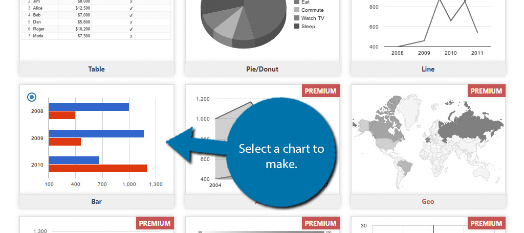
This Chart Maker allows you to create four kinds of charts in WordPress that include a table, pie, line, and bar graph. The rest of the options are locked behind the premium version. The good news is that the process is nearly identical for each type.
The only difference is for the specifics of that graph, like determining the color of bars in a bar graph. Overall, it’s pretty straightforward.
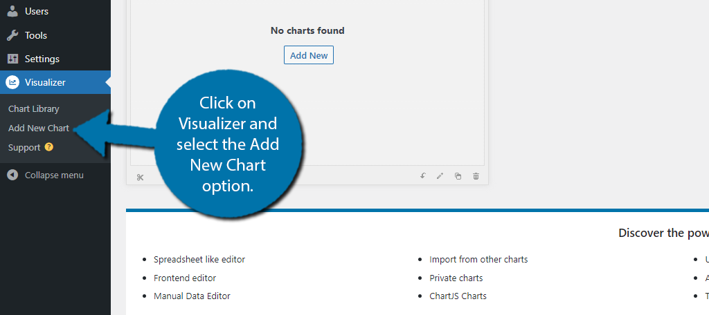
On the left-hand admin panel, click on Visualizer and select the Add New Chart option.
A pop-up will appear containing all of the charts the plugin provides. Pick the option you want to use. For reference, I am making a bar chart in WordPress.
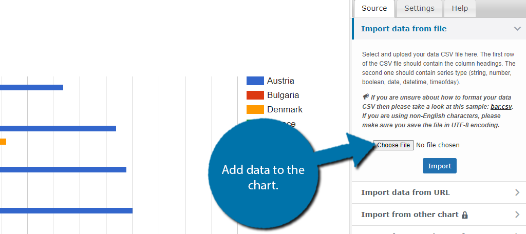
Click on the “Next” button and you will see a sample of the graph with some dummy data. Now you just need to actually enter the real data, which you have two options for in the free version.
You can use a CSV file (Excel) or you can provide a URL link. The other options like manual are locked behind premium. Use one of the available methods to add the data to the chart.
Note: If you’re using Excel like me, you need to make row one the column headers, and row two will contain the numbers.
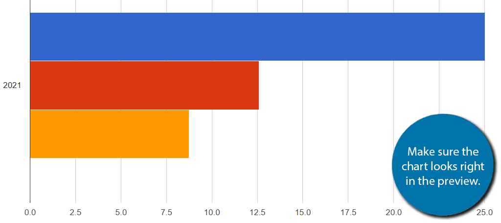
A preview of your graph will appear. I made one for the console sales in 2021. Double-check that the information is correct. If not, you will need to go back to the file, edit, and reupload it.
Don’t worry about the colors, we need to save the chart to change them. Click on the “Create Chart” button.
Step 3: Edit the Chart (Optional)
You will now see the chart you just made in the list of available charts. If you want to change visual elements, click on it. In this case, you probably want to change the color. If not feel free to skip this step.
Note: You cannot change any of the actual data. That requires re-uploading a new file with the correct info. So, if you notice that something is misspelled or the data is incorrect, you need to recreate the chart. In the premium version, you can manually enter the data, thus you can make changes on the fly.
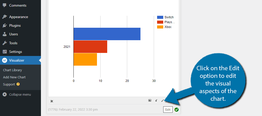
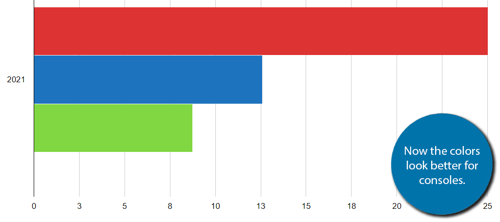
Click on the Settings tab and select Series Settings. You should see each of the data points for your graph. In this case, mine are the Switch, PlayStation, and Xbox.
Expand the options and you can select a color and whether it is in the legend or not. Options are different for each chart type.
You can see the changes as you make them. Click on the “Save Chart” button to save the changes. Here is an updated view:
Step 4: Add the Chart to A Post or Page
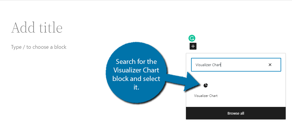
Adding the chart is as easy as adding a block in Gutenberg.
Go to any post or page on your website. Click on the “+” button and search for the Visualizer Chart block and select it.
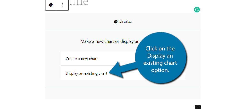
You will have the option to create a new chart or choose an existing chart (this process is identical to what we just did, but it is done within Gutenberg).
Click on the Display an existing chart option.
Choose the chart you made in the previous step.
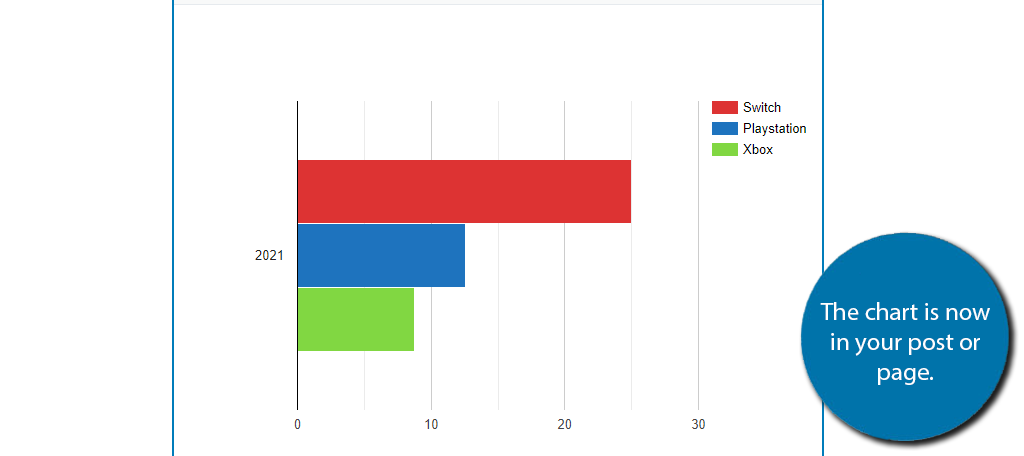
You can repeat these steps to create multiple charts and graphs and add them to your posts and pages. Remember that you can add as many as you want to a single post or page. You can add them as a widget as well, but due to their nature, it’s probably not a good idea.
Congratulations on learning how to create responsive charts and graphs in WordPress.
Is Premium Worth It?
In a lot of plugins, the premium version isn’t always necessary or worth it for that matter. But in this case, it probably is.
By far the biggest convenience of premium is being able to manually enter data into the charts. This allows you to easily make changes and additions to charts and graphs. Without it, you need to upload a new file every time, which can eat up your time.
Not to mention that you gain access to a wide variety of other charts and graphs to use in WordPress. If you plan on heavily using this plugin. I can definitely say that the premium version is worth the purchase.
Help Your Data Points Standout With WordPress Charts
Data is a powerful tool, but it can be hard to digest when it is in its numeric form. That’s where charts and graphs come into play. They can make the data easy to read and enhance the visuals of your content.
Just make sure that the data you add is actually correct. And, always include any sources you use to increase credibility.
How easy did you find the plugin to use? Why did you want to add charts to your WordPress site?