For the most part, the Elementor page builder is fully responsive and mobile-ready. However, many editable features have mobile, tablet, and desktop settings. The most common uses of these settings include text size, margin, and padding of elements, etc.
If you want to, and in some cases need to, adjust some Elementor settings for mobile, the process to view and access those settings is simple to get to. This process works great when creating a landing page as well.
Adjust Elementor Settings For Mobile
Elementor allows you to adjust mobile and tablet settings within the page builder. You can also see these settings update in real-time. Use the steps below for the various mobile adjustment settings.
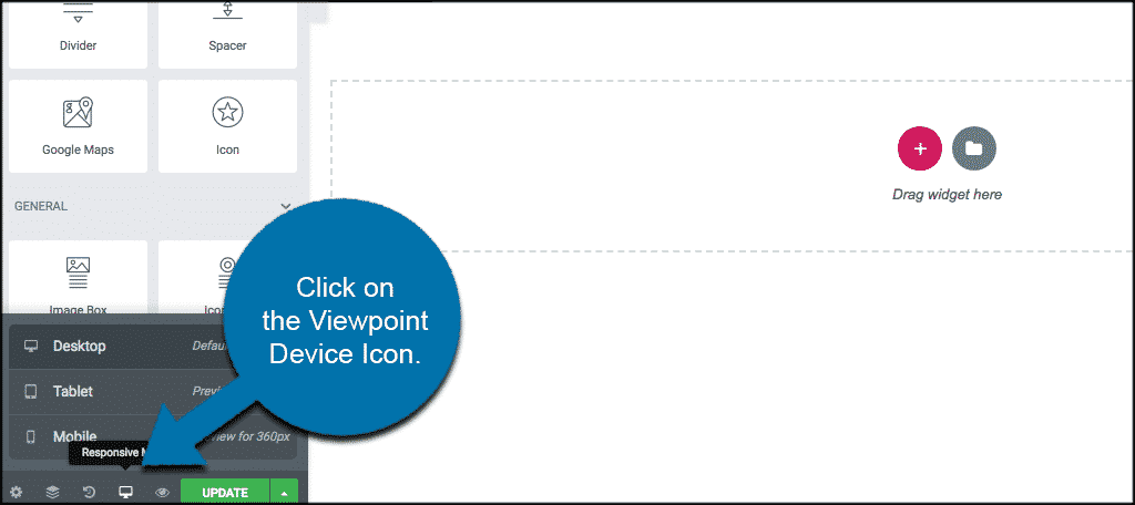
Step 1: Click on the Viewport Icon
To adjust these settings look for the Viewport Icon next to the individual element you wish to control. You will see this icon on the bottom right of the editor. It is there no matter what element you are currently editing.
Click on it and then choose the device icon you wish to adjust settings for.
Once you choose the device setting you want to edit, feel free to make any adjustments to your current settings and you will see them change as you go.
Step 2: Controlling Background Images Independently
You can even control background images independently on each device setting’s option.
Background images in Elementor are automatically device-responsive, but you also have control over more options for each device.
Remember, you can also keep these settings in place for all pages if you use the duplicate pages option in Elementor.
Controlling Responsive Background Images and Borders
Background Image: You can choose a different background image for each device if needed, whether it is a size-appropriate version of the same image or a completely different image altogether.
Background Image Display Options: You can select a different image position, attachment, repeat, and size for each device. In this way, you have more control over which area of the image is displayed on different device sizes.
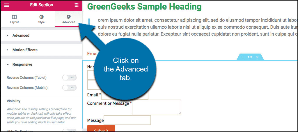
Step 3: Show or Hide a Section Using Visibility
You can choose to show or hide a section according to the device. To do this you access the “Advanced” tab in the setting’s section area.
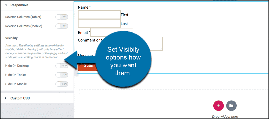
In the “Responsive” section set the Visibility preferences how you prefer them.
Step 4: Change Mobile and Tablet Breakpoints
You also want to double-check your breakpoints for both mobile and tablet. YOu can control exactly when the site breaks into both points using the Style tab.
Go to Elementor > Settings > Style Tab, and set the breakpoint value for mobile and tablet how you see fit.
Now save your changes and go to Elementor > Tools > General Tab > Regenerate CSS, and click “Regenerate Files.”
Step 5: Columns Ordering
The Columns Ordering feature reverses the ordering of columns.
To use Columns Ordering go to Section Setting > Advanced > Responsive > Reverse Columns and set it to “Yes.”
Note: None of the suggested editing and settings options above will interfere with an Elementor sticky header you may have put in place.
Elementor has some very responsive and intuitive settings you can easily adjust to make sure your website shows exactly how you want it to on mobile.
Once you have completed the steps above, your website will show exactly how you have set it on both mobile and tablet.
Final Thoughts
The Elementor WordPress page builder makes building a website fun. It also gives you a drag and drop option that allows you to see your pages being built in real-time. Once you familiarize yourself with the layout and styling options the builder has, then you will be able to build dynamic, fully responsive WordPress websites without having to write any code.